How to Choose an Exterior Paint Color (6 Steps)
A step by step system for choosing an exterior paint color you will not regret, from reading your roof and brick to testing full size swatches in real light.
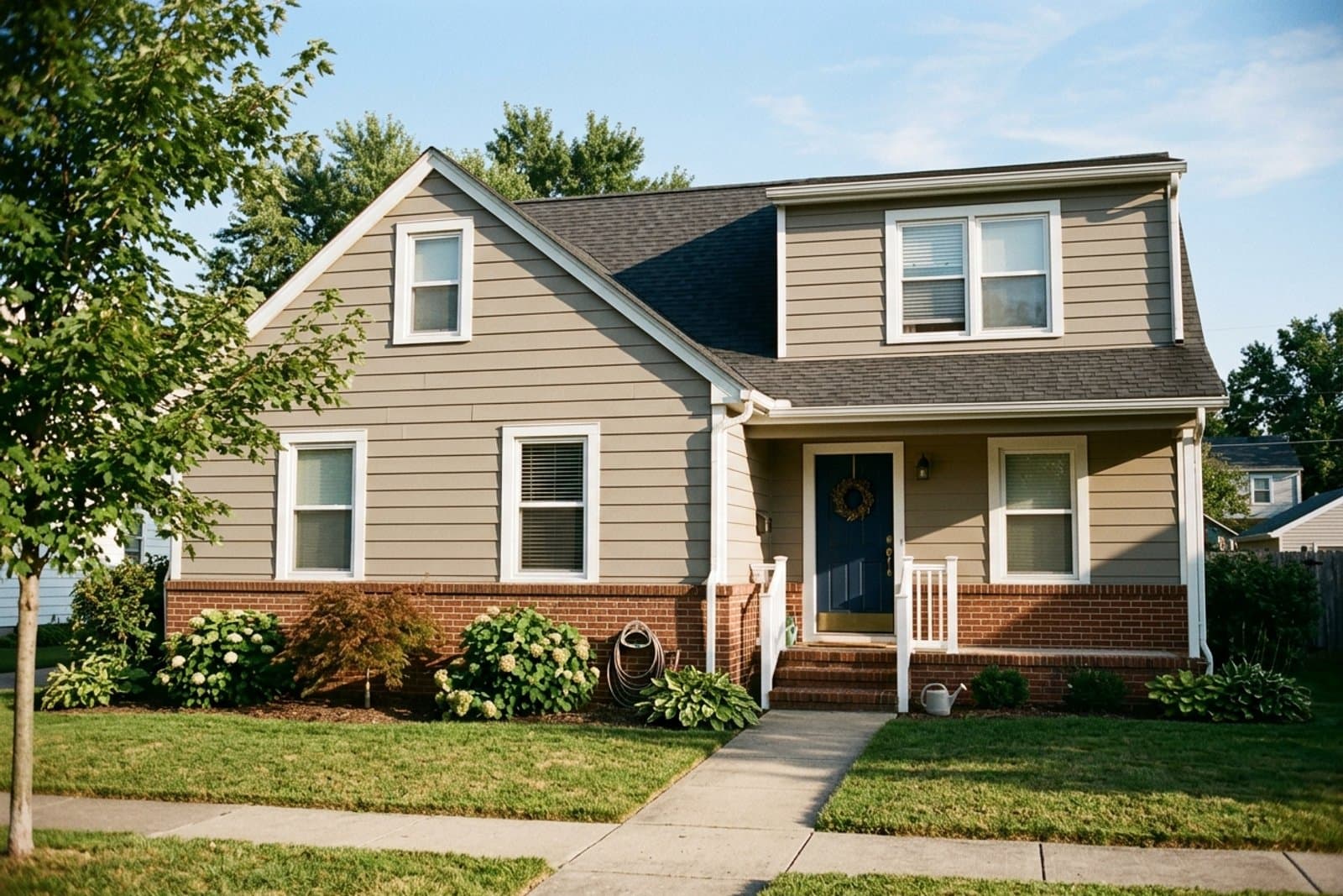
Start with what you cannot change: your roof, brick, or stone carries a warm or cool undertone, and the paint has to agree with it. Narrow to three candidates, paint two foot square swatches on a sunny wall and a shaded one, and watch them for three days at morning, midday, and dusk.
Check the light reflectance value (LRV) printed on every chip while you look. Body under LRV 60 hides siding flaws; trim above LRV 80, like Sherwin-Williams Alabaster SW 7008, keeps the edges crisp.
Standing in the paint aisle with three fan decks and a growing headache is a rite of passage. Exterior color decisions fail for a small set of predictable reasons, and all of them are avoidable if you run a process instead of trusting the first swatch you like. This guide is for homeowners about to buy paint or book a painter. It is not a trend roundup, and it is not for interior walls, where the light behaves very differently and a north facing room needs its own warm palette.
What Should You Decide Before You Look at Any Swatch?
Take stock of the fixed elements first: the roof, the brick, the stone, the pathway, anything you are not replacing. Each of those materials carries an undertone, and your paint has to sit alongside it for the next ten years. Reading undertones is the same skill that decides which colors work in a north facing room, just applied to materials instead of daylight.

Both major manufacturers print a light reflectance value (LRV) on every chip and fan deck page, on a scale where 0 is absolute black and 100 is pure white. It is the one number on the chip that predicts how the color behaves at full scale, and most people ignore it. Below LRV 60, a body color absorbs enough light to disguise lap siding seams and small repairs. Above LRV 80, a trim color holds a crisp edge against almost any body.
| Your fixed elements | Body direction | Real examples |
|---|---|---|
| Red or orange brick, terracotta roof, tan stone | Warm creams, greige, deep browns | Accessible Beige SW 7036 (LRV 58), Revere Pewter HC-172 (LRV 55), Edgecomb Gray HC-173, Alabaster SW 7008 (LRV 82) |
| Gray stone, blue gray slate, cool toned brick | Crisp whites, soft blues, true grays | Simply White OC-117, Repose Gray SW 7015 (LRV 58), Hale Navy HC-154 (LRV 8), Chantilly Lace OC-65 (LRV 90) |
| Charcoal or black roof, gray concrete | Warm or cool both work | Iron Ore SW 7069 (LRV 6), Evergreen Fog SW 9130 (LRV 30), Agreeable Gray SW 7029 (LRV 60), Pewter Green SW 6208 (LRV 12) |
Codes prefixed SW are Sherwin-Williams; OC and HC are Benjamin Moore. LRV figures here are the manufacturers' published values, rounded to the nearest whole number. Both brands list the LRV for every color on their site, so you can check any candidate not shown here before buying a sample.
Warm fixed elements
Terracotta roof tiles, red or orange brick, and tan stone all pull warm. They sit comfortably beside creams, warm grays, taupe, and deep browns. Put a cool blue gray next to warm brick and the brick turns visibly pink, which is the single most common exterior color mistake.
Cool fixed elements
Gray stone, blue gray slate, and cool toned brick want cooler company: crisp whites, soft blues, and classic grays.
Neutral fixed elements
Black or charcoal roofing and gray concrete are the most forgiving. They take a warm or cool body color equally well, which widens your options rather than narrowing them. Evergreen Fog SW 9130, Sherwin-Williams' 2022 Color of the Year, is popular on exteriors for exactly this reason: at LRV 30 it reads as a muted sage against warm and cool fixed elements alike.
How Many Colors Should You Actually Test?
Three, and no more. It is tempting to collect a dozen swatches, and it reliably makes the decision harder rather than better. Pick your top three from the direction your fixed elements point, then treat every other color as a distraction.
This is the same narrowing logic that makes a small palette feel calmer indoors: fewer choices, held to firmly. Past three or four options, most people stop comparing colors against the house and start comparing them against each other, which is a different and much less useful question. The three should also be meaningfully different from one another rather than three versions of the same greige. If you cannot tell two of your candidates apart at arm's length on the chip, you will not tell them apart on the house either, so drop one and add something with a genuinely different undertone. Three sample pots cost about the price of lunch, and the mistake they prevent costs a weekend and several hundred dollars.
How Do You Test Exterior Paint Properly?
A paint chip the size of a business card tells you almost nothing about how a color reads across a whole facade. Buy sample pots of your three and paint swatches roughly two feet square, in at least two places: one wall that gets morning sun, one that sits in afternoon shade.

Then leave them alone for three days and look at three points daily: morning, midday, and just before sunset. A color that looks right at noon can turn muddy or flat in evening light. If you still want it after three days across every lighting condition, you have your answer. This is the same reason a room can stay dark after you paint it: the color is only half the story, and the light does the rest.
Look at the swatch from where the house is actually seen
An exterior is judged from farther away than any surface you will ever paint indoors, and distance is not neutral. Past about thirty feet, fine texture disappears, contrast softens, and colors drift lighter and cooler, so the swatch you approved at arm's length is not the color your neighbors see.
My habit on any facade decision is to walk to the spot where the house is most often viewed, usually across the street or at the end of the driveway, and judge the swatches only from there. Bring binoculars if it helps you resist walking closer. A color chosen at the wall pleases you for an afternoon; a color chosen from the street pleases you every time you come home.
Should Body, Trim, and Door Be Chosen Together?
Yes. Exterior color is three decisions, not one, and choosing them in isolation is what produces a house that looks assembled rather than designed. The reliable structure is one quiet body, one high contrast trim, and one saturated accent at the door.
- Body. The largest surface, so it sets the overall tone. Go quieter here than you think you want, and stay under LRV 60 if your siding has visible seams or patched repairs.
- Trim. Frames the windows, doors, and rooflines. Usually white, black, or a deep neutral, and its job is contrast rather than personality. A high LRV white like Alabaster SW 7008 or Simply White OC-117 keeps the edges reading crisp from the street.
- Front door. The one place a bolder, more personal color is safe, because it is small, visually contained, and cheap to repaint when you tire of it.
The ratio matters as much as the colors. Roughly 70 percent body, 25 percent trim, and 5 percent door keeps the accent feeling deliberate. Push the door color onto the shutters and porch ceiling too and it stops reading as an accent and starts reading as a second body color.
Trim whites worth knowing
Trim is where most people default to whatever white the painter has in the truck. These four behave differently enough to be worth choosing on purpose:
| Trim white | LRV | Reads as |
|---|---|---|
| Chantilly Lace OC-65 | 90 | The cleanest, coolest white; sharpest against dark bodies |
| Extra White SW 7006 | 86 | Bright and slightly cool, a safe default on gray bodies |
| White Dove OC-17 | 83 | Soft warm white; the gentlest contrast, good on cream bodies |
| Alabaster SW 7008 | 82 | Warm and creamy; pairs naturally with brick and greige |
Front door colors that hold up
The door is the cheapest place to be brave, and a quart covers it. Deep saturated colors age better outdoors than pastels, which chalk and fade faster in direct sun:
- Naval SW 6244 (LRV 4) and Hale Navy HC-154 (LRV 8) for navy, the most forgiving accent across almost every body color
- Tricorn Black SW 6258 (LRV 3) for a true black that does not go blue in shade
- Kendall Charcoal HC-166 for a softer near-black on warm bodies
- Rookwood Sash Green SW 2810 for a historic deep green, especially on brick
- Caliente AF-290, Benjamin Moore's 2018 Color of the Year, for a red that stays warm rather than turning orange
What Exterior Color Makes a House Look Expensive?
Restraint does, more than any specific color. Houses that read as expensive almost always use fewer colors, higher contrast between body and trim, and a body color that stays quiet. Deep charcoals and blacks like Iron Ore SW 7069 at LRV 6, warm off whites, and muted greens photograph as considered because they let the architecture and the landscaping carry the interest.

What reads as cheap is rarely one bad color. It is usually three or four colors competing at similar volume, a body color chosen at a value close to the trim so nothing has an edge, or an accent repeated in so many places that it stops being an accent. The house above uses exactly three colors and gives each one a clearly different job. Spending more per gallon does not buy this look. Choosing fewer colors and pushing the contrast between them does.
Five combinations that work
Each of these keeps a wide LRV gap between body and trim, which is what produces the crisp edge. Use them as starting points to test, not as a substitute for testing:
| Body | Trim | Door | Best with |
|---|---|---|---|
| Iron Ore SW 7069 (LRV 6) | Extra White SW 7006 (LRV 86) | Rookwood Sash Green SW 2810 | Charcoal or black roof |
| Accessible Beige SW 7036 (LRV 58) | Alabaster SW 7008 (LRV 82) | Hale Navy HC-154 | Red or orange brick |
| Evergreen Fog SW 9130 (LRV 30) | White Dove OC-17 (LRV 83) | Tricorn Black SW 6258 | Warm stone, wood accents |
| Repose Gray SW 7015 (LRV 58) | Chantilly Lace OC-65 (LRV 90) | Naval SW 6244 | Gray slate or blue gray brick |
| Revere Pewter HC-172 (LRV 55) | Simply White OC-117 | Caliente AF-290 | Tan stone, brown roof |
The pattern to notice is the gap. Every row puts at least 24 LRV points between body and trim, and the darkest body opens that to 80. That distance is doing more work than any individual color choice, which is why a combination that looks safe on chips can still fall flat: if body and trim land within about 15 points of each other, the trim stops reading as trim from the street.
Can You Test Exterior Paint Colors From a Photo of Your House?
Partly. Treat it as a useful first pass. Uploading a photo to a visualizer tool is genuinely good at the early step this guide covers first: seeing whether a color family fights your roof and brick, and narrowing a dozen candidates down to three worth buying samples of.
What a photo cannot do is reproduce how the color behaves in your actual light. A screen shows you one moment, at one exposure, with your phone's own white balance applied on top. The reason to paint two foot swatches and watch them for three days is precisely that the color changes across the day, and no rendered image captures that shift. Use a visualizer to eliminate candidates, then confirm the survivors on the wall.
Does the Neighborhood Actually Matter?
Somewhat, and less than most people fear. Walk or drive your street and note what is already there. You do not need to match your neighbors, and copying them exactly wastes the one decision on the house that is entirely yours.
What you are checking for is whether your candidate would read as deliberate or accidental in context. A color sharply out of step with a historic streetscape tends to look like a mistake even when it is objectively a good color. The practical constraint is stricter than the aesthetic one: check your homeowners association (HOA) rules or historic district restrictions before you finalize, not after the first coat. Some districts maintain an approved palette, and a few require review before any exterior color change at all. That approval can take weeks, which is worth knowing before the painter is booked.
Assume It Will Land One Shade Darker
Color intensifies at scale. A greige that reads as soft and barely there on a chip can land as a decisively gray green once it covers 1,500 square feet of siding. Assume your final color will look roughly one shade darker and more saturated than the sample, and choose the version that feels slightly too quiet on the chip. That instinct is also why color affects mood so strongly indoors: quantity changes the experience, not just the hue.
Mistakes to Avoid
- Choosing from a phone screen, which shifts color with its own brightness and white balance, and never testing on the actual house
- Ignoring a metal roof, which reflects light onto the walls below and can shift the paint tone noticeably
- Rushing because the painter is already booked, which is how a color nobody loves gets three coats
- Skipping the HOA or historic district check until after the paint is bought
- Testing swatches on primer or bare patched siding rather than on the existing surface, which throws the color off
Frequently Asked Questions
How many paint samples should I test before deciding?
Two or three full size swatches. More than that tends to produce decision fatigue rather than clarity, and the differences between similar neutrals stop being visible once you are comparing six at once.
Should I choose my roof color or paint color first?
The roof, almost always. It is the most expensive element and the least frequently replaced, so the paint should be chosen to complement the roof rather than the reverse.
How do I match paint to red brick?
Work with the brick's undertone rather than against it. Red and orange brick sits well with creams, warm whites, greige, and deep browns, and fights with cool blue grays, which make the brick look pink.
Do I need to hire a color consultant?
Usually not. A structured testing process resolves most exterior decisions on its own. A consultant earns their fee on historic homes, on houses with three or more fixed materials in view at once, or when a previous attempt already went wrong.
How long should paint swatches stay up before I decide?
Three days minimum, checked at morning, midday, and dusk. Anything shorter and you are judging the color in one lighting condition rather than all of them.
What LRV should an exterior body color be?
Below 60 for most houses. A body color under LRV 60 absorbs enough light to disguise lap siding seams, patched repairs, and minor surface flaws, while trim above LRV 80 keeps window and roofline edges crisp against it.
What are the best exterior trim colors?
High LRV whites hold the crispest edge. Chantilly Lace OC-65 at LRV 90 is the cleanest and coolest, Extra White SW 7006 at 86 is a bright safe default, White Dove OC-17 at 83 reads soft and warm, and Alabaster SW 7008 at 82 pairs naturally with brick and greige bodies.
What is a good front door color?
Deep saturated colors last longest outdoors, since pastels chalk and fade faster in direct sun. Navy (Naval SW 6244, Hale Navy HC-154), true black (Tricorn Black SW 6258), and historic deep greens (Rookwood Sash Green SW 2810) work across the widest range of body colors.
Final Takeaway
Choosing an exterior color is less about finding the perfect shade and more about running a decent process. Start with what is fixed, narrow to three early, test at full scale in real light, watch for three days, and decide body, trim, and door as one system. The color that survives all six steps is almost always the right one, and it will be the one you still like in year five.
The Noticer
For thoughtful people who notice spaces.
What did you notice?
Did something in this story make you see your own space differently?
Check your exterior color before you buy paint
Send Archie a photo of your house with the roof and brick in frame. Archie reads the undertones you cannot change and returns three body, trim, and door combinations that work with them.
Check my exterior color with ArchieAdvertisement. Archie is made by STUDIO DID IT, the studio that publishes Spatia.
Related Articles
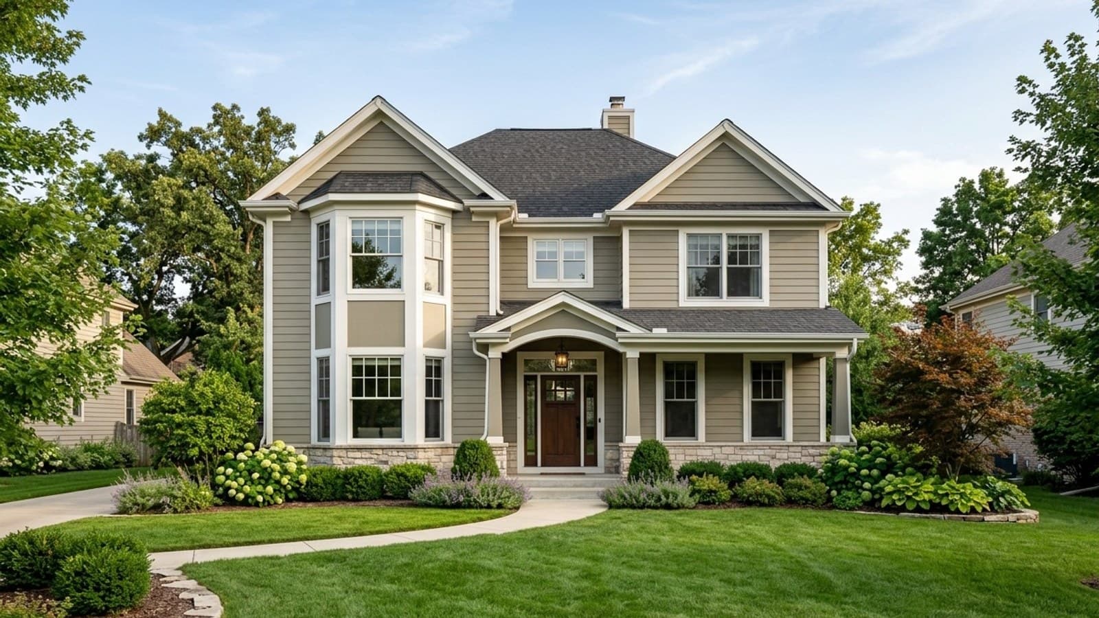
Exterior House Paint Colors 2026 (What Replaced Gray)
The exterior house paint colors homeowners are choosing in 2026, from the three Colors of the Year to what Zillow found actually raises an offer price.
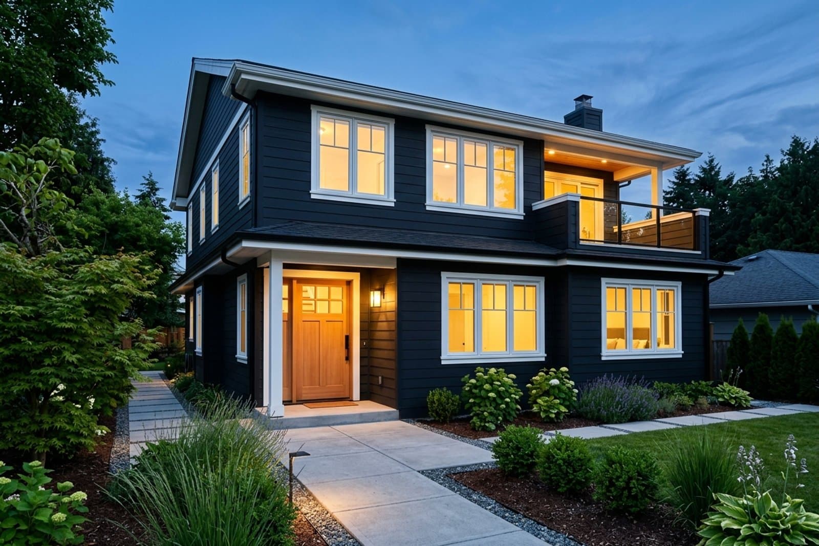
Black House Paint Exterior: What to Know First
Black house paint on an exterior looks expensive and runs hot. See the real heat numbers, the colors that hold up, and the trim that makes it work.
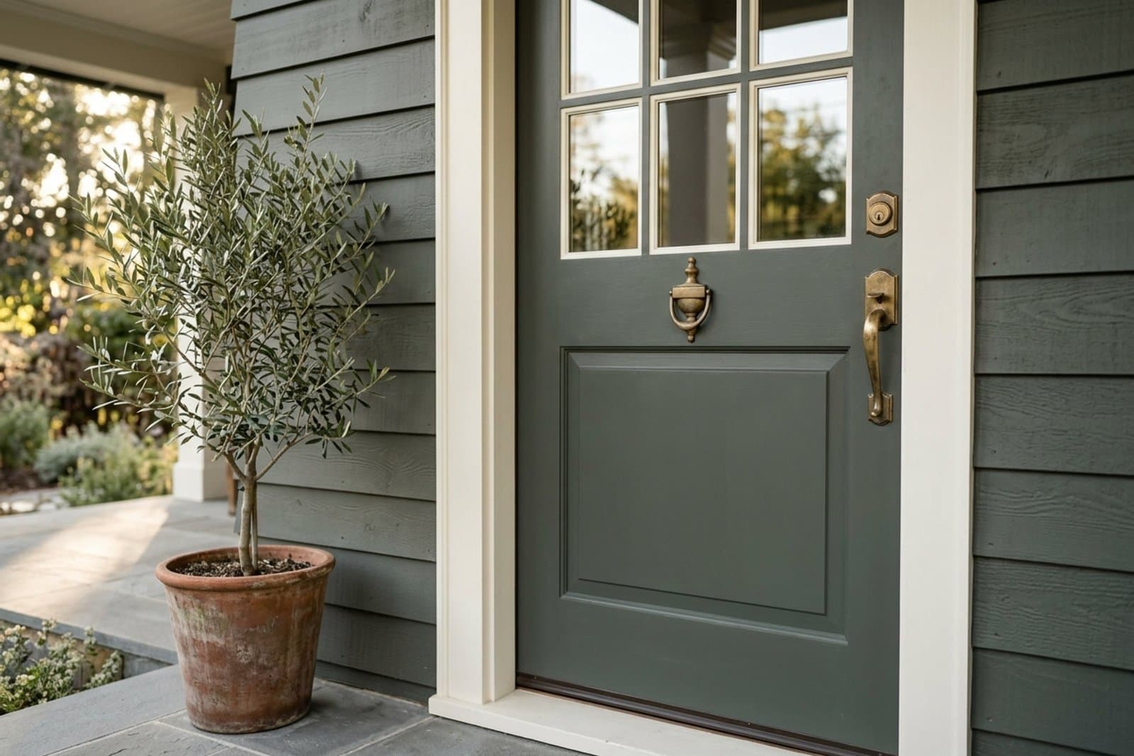
Evergreen Fog (Sherwin-Williams): Still Trending in 2026?
Why Sherwin-Williams Evergreen Fog is spiking in search again. See its real undertones, what it pairs with, and where the green-gray works best.