Why Does My Room Feel Flat?
A room can look styled and still feel flat because every visual element sits below three feet, giving the eye no reason to travel up. Four principles push weight above the band: raise the sight line, float the sofa, kill the overhead after sunset, and build depth the way a landscape painter does.

A room can have every right piece and still read as flat. Almost always the reason is height: every visible thing sits below three feet, so the eye has no reason to travel up, and the whole room compresses into one low horizontal band.
This is for the room that already looks styled and still feels wrong. If you are starting from an empty space, our studio zoning guide sets up the layout first. Come back here once the boxes are in place.
Why does a room feel flat when the furniture is fine?
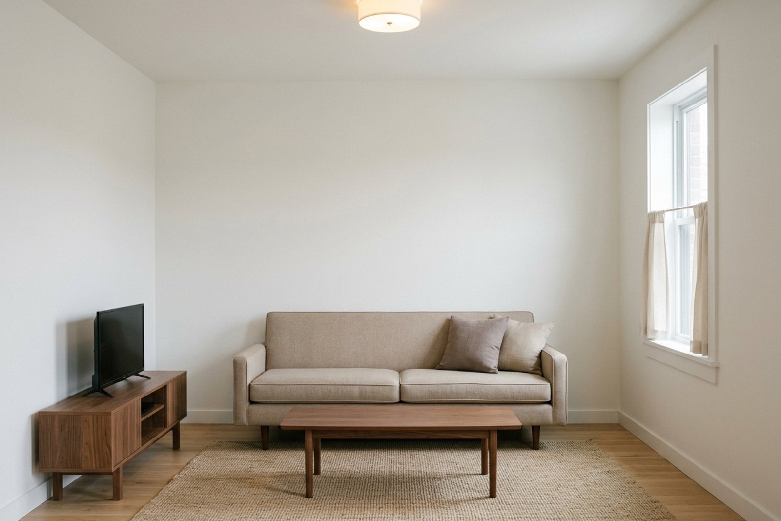
The problem is not the furniture. It is the height at which everything lives. Sofa arms at 30 inches. Coffee tables at 16. TV stands at 24. Low consoles at 32. Every visual anchor lands inside a band between the floor and roughly three feet, and the eye reads that band as one flat plane. The room feels flat because it is flat, visually. Your eye moves horizontally along the band and never has a reason to travel up into the volume of air the room actually holds. Once you name the pattern it is impossible to unsee. Rooms that read expensive break the band deliberately. They push visual weight above five feet, they pull furniture away from the walls, they light the room from below the ceiling, and they build depth into the room the way a landscape painter builds a foreground, a midground, and a background. The four moves below do that work, in order of impact.
1. Raise the sight line before you buy anything
Most curtain rods sit right at the window frame. Most art hangs at 60 inches, called "eye level," which is exactly the same height as the sofa back. That is the vertical band, hung on the wall.
The reason it fails is quiet: the eye has no runway above the furniture. A rod at the window frame tells the room the ceiling starts there, even when the actual ceiling is three feet higher. A picture at 60 inches confirms the same band from a different angle. The wall keeps saying "flat" over and over.
The fix works because raising the anchors gives the eye a reason to travel up. The ceiling stops being an abstract idea and starts being part of the room. A rod mounted four to six inches below the ceiling turns a nine foot wall into a nine foot wall, which is a different room than a nine foot wall pretending to be a six foot one.
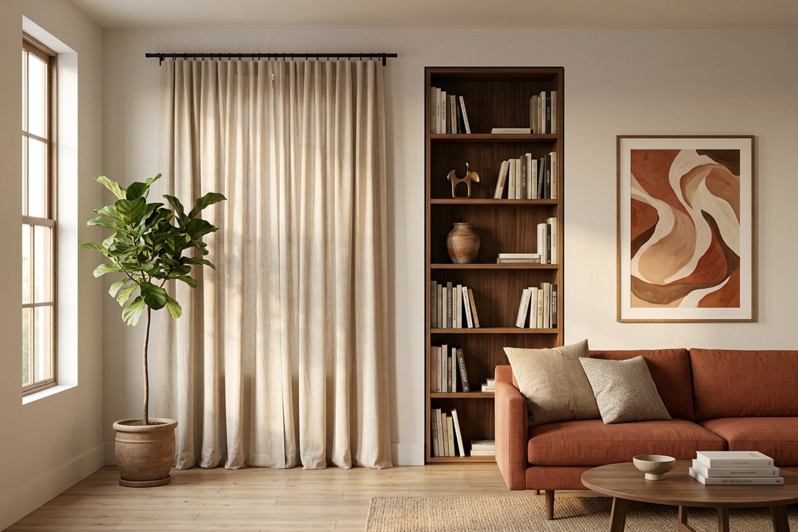
Apply it three ways. Mount curtain rods four to six inches below the ceiling, not at the window frame, and let the fabric fall floor to ceiling. Hang the top edge of art at 66 to 72 inches instead of 60. If a wall is empty above five feet, add one tall element per wall: a bookshelf that reaches within a foot of the ceiling, a hanging plant on a long cord, or a stacked pair of leaning frames.
2. Float the sofa six to twelve inches off the wall
Most sofas sit hard against the wall. Most beds too. Every large piece ends up serving as an extension of the wall behind it, and the room reads as a hollow rectangle with a fringe of furniture stuck to the perimeter.
The reason this fails is that a sofa touching the wall merges with the wall visually. The eye no longer sees two objects. It sees one continuous plane. The room loses its middle. The couch becomes part of the architecture and stops being a piece of furniture, which is not the compliment it sounds like.
The fix works because a gap between the sofa and the wall creates a small pocket of depth. That gap tells the eye there is more room behind the sofa than you can see, and the room reads as roomier than it is. Six inches is usually enough. Twelve inches is often better. The exact number does not matter. The shadow line does.
Apply it in the direction with the most floor to spare. In a standard living room, pull the sofa six to twelve inches off the long wall, drop a slim console table into the gap (a ten inch deep sofa table works), and place a small lamp on the console. The lamp does two jobs. It lights the gap from behind, which reinforces the depth, and it pulls the sofa forward in the composition. Studios can borrow the same move at a smaller scale using the reading nook layout, where a single chair pulled a foot off the corner reads as a defined zone rather than an accessory.
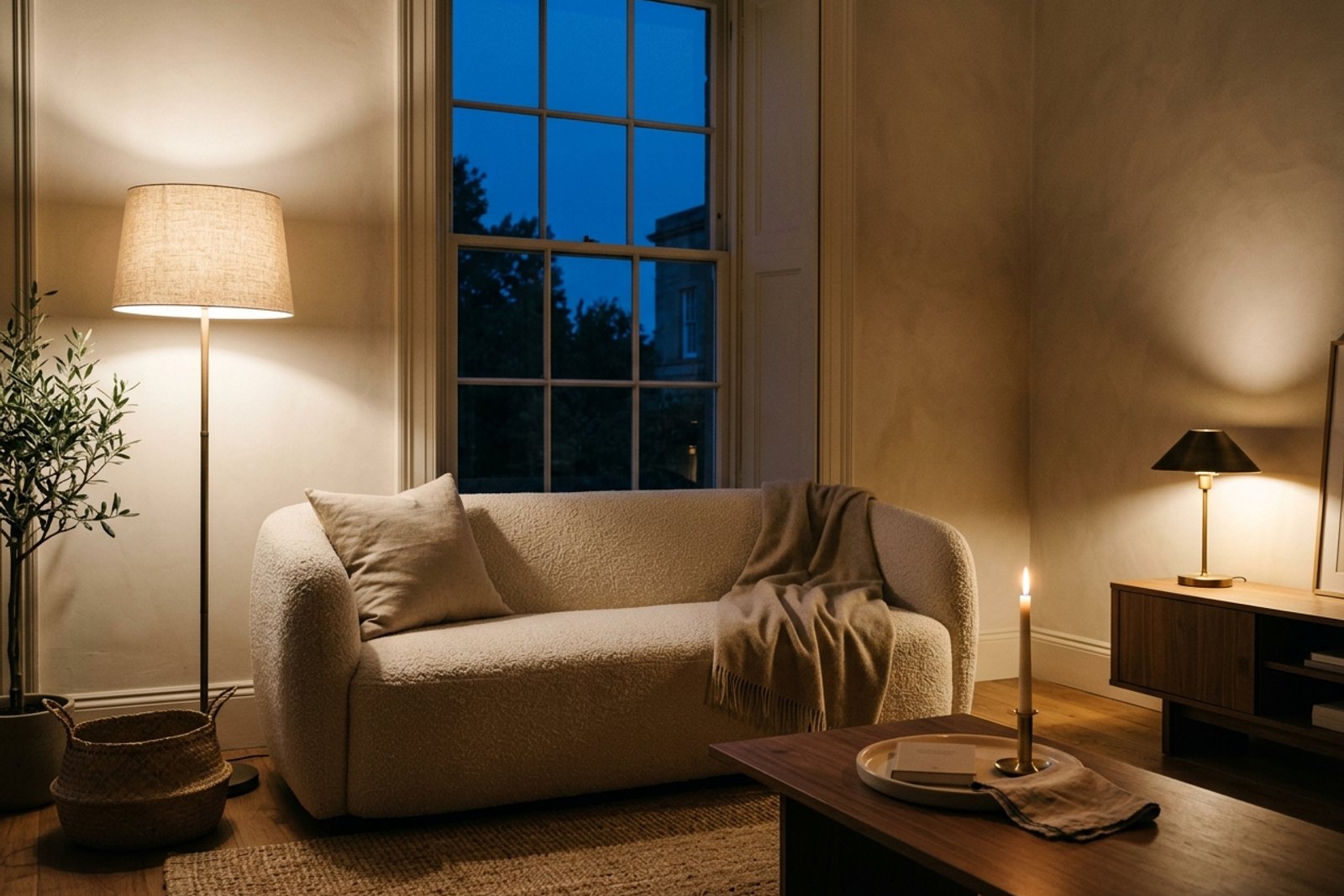
3. Turn off the overhead after sunset
Most rooms are lit by one overhead fixture. During the day, sunlight covers the miss. After dark, the overhead takes over, and the room flattens again.
The reason overhead lighting fails after sunset is that light coming straight down from the ceiling erases shadows. Shadows are how the eye reads depth. Without them, every object turns into a shape without weight, and the room turns into a diagram. It is the visual equivalent of a fluorescent office at nine at night.
The fix works because directional light (a floor lamp angled off a wall, a table lamp low on a console, a wall sconce shooting up) puts shadows back into the room. Shadows give furniture weight, walls texture, and corners depth. The room stops looking like a plan and starts looking like a place.
Apply it as a lighting hierarchy. Kill the overhead after sunset. Use three warm 2700K sources at three different heights: one floor lamp taller than the sofa, one table lamp at coffee table height, and one low source (a candle, a small task lamp, a floor level LED) below the sofa. The heights matter more than the count. Three lamps at the same height is one lamp with backup singers. The warm bulb temperature also carries the atmosphere the way the palette does in our Scandinavian small bedroom guide; the light is doing the styling that a wall color would do in daytime.
4. Build depth like a landscape painter
The last principle is one landscape painters have used for 400 years and most rooms ignore. A landscape has a foreground (grass, a fence), a midground (a tree, a barn), and a background (distant hills, sky). The eye reads the depth by comparing the three planes to each other.
The reason a room without three planes feels flat is the same reason a two tone painting reads as a flag. There is nothing for the eye to compare and no distance to travel. Most rooms have a background (the far wall) and a foreground (the sofa) and nothing between them. The middle of the room is empty.
The fix works because filling the midground puts a bridge between the foreground and the far wall. A single object at the correct depth turns the room from two planes into three, and the eye finally has somewhere to rest between the sofa and the wall. An armchair pulled four feet in front of the sofa. A small round table between the sofa and the far wall. A rug that ends before the far wall does, leaving a strip of floor visible along the baseboard.
Apply it as a test. Stand in the doorway and count the depth planes between you and the far wall. If the answer is two, the room is flat. Add one midground object: a chair, a floor lamp, a low bench, a plant on a stand. Do not add three. The point is depth, not clutter.
The four moves work together, or not at all
Raising the sight line without floating the sofa moves the flat band six inches farther out. Floating the sofa without changing the lighting still leaves the room flat at night. Adding a midground object without directional lighting means the object gets buried in the overhead flood. Rooms that read as expensive break all four principles at once, quietly, because the person who designed them was seeing the room the whole time, not styling it.
That is the harder half of this. Naming what a room is doing wrong is a skill built over years of walking through rooms and comparing them. If you cannot yet tell which of the four principles your room is breaking, that is normal. It is also what Archie was built for.
Matt Jang has walked through more than 60 styled rooms in the last year that still felt flat. Every one of them was breaking at least two of the four principles above, and usually all four.
Ask Archie which principle your room is breaking
Send Archie a photo of the room that feels off. Archie names the specific principle the room is breaking, whether that is the low visual band, the wall hugging sofa, the flat overhead lighting, or a missing midground, and returns the one smallest fix that changes the most.
Diagnose my room with ArchieRelated Articles

9 Scandinavian Living Room Ideas That Feel Warm, Not Cold
Scandinavian living rooms read warm when you swap stark white for cream, the overhead for two lamps, and the matched set for layered pieces gathered slowly. Nine moves under $1,800.

6 Ways to Design a Home That Lowers Your Stress
Stress doesn't only come from work or money. The shape, light, and clutter of your home keep your nervous system on quiet alert. Six design moves that change it.

7 Living Room Layout Mistakes Almost Everyone Makes
Your furniture arrangement might be the reason your living room doesn't feel right. Here are the most common layout mistakes and how to fix them.