10 Paint Colors That Instantly Transform Small Rooms
The right paint colors make small rooms feel twice their size. See 10 designer picks, with real LRV values, that open up any cramped space.

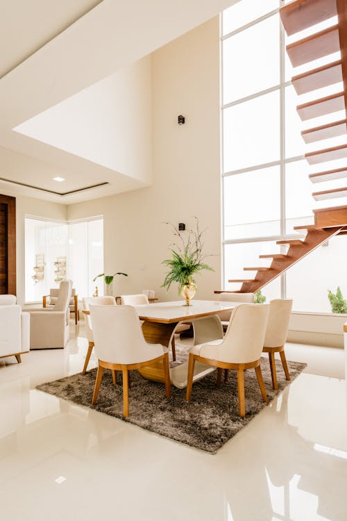
The best paint colors for small rooms are light shades with a high Light Reflectance Value (LRV) above 55, like soft white, pale gray-blue, and warm greige. They bounce daylight back and push the walls outward, so a cramped room reads as larger. Benjamin Moore Simply White (LRV 89.52) is the designer default, and a satin finish stretches the effect further than flat.
This one is for renters and small space dwellers who want a lighter, larger feel without renovating, not for anyone chasing a cozy, cocooning dark room.
Why Color Matters More Than Square Footage
Most people reach for furniture tricks or mirrors first. The bigger lever is on your walls. Color changes how we read depth, height, and openness, and the right shade can turn a cramped space into an airy one (more on that in our guide to interior color psychology). Designers screen colors for small rooms by their Light Reflectance Value (LRV), the 0 to 100 scale Benjamin Moore and Sherwin-Williams print on every color chip; the higher the number, the more daylight a wall bounces back, which is exactly what a tight room needs. If your room reads more cramped than dark, our note on why a room feels cramped covers the layout side.
What paint colors make a small room look bigger?
Light neutrals above LRV 55 do it: soft white, pale gray-blue, greige. Light colors reflect daylight and blur the line where the wall meets the ceiling, so the edges of the room feel further away. Here are ten that designers reach for:
1. Soft White (Benjamin Moore Simply White OC-117)
Not stark, not yellow, just clean. At an LRV of 89.52 it reflects almost all the light that reaches it while still feeling warm and livable. It's the baseline that interior designers reach for first.
2. Pale Gray-Blue (Benjamin Moore Quiet Moments 1563)
This color tricks the eye into seeing more depth. Its LRV of about 61 keeps the room bright, while the soft blue undertone mimics the sky and creates an openness that pure gray can't achieve.
3. Warm Greige (Sherwin-Williams Accessible Beige SW 7036)
The middle ground between gray and beige. At an LRV of 58 it adds warmth without shrinking the room, and it works with virtually any furniture style.
4. Dusty Sage (Sherwin-Williams Evergreen Fog SW 9130)
Green connects us to nature and has a calming effect that makes walls feel like they're receding. Evergreen Fog sits at a deeper LRV of 30, yet it recedes by hue rather than lightness, so it reads sophisticated in a small room without going dark and heavy.
5. Pale Lavender (Benjamin Moore Misty Lilac 2071-70)
An unexpected choice that works beautifully in bedrooms. Its high LRV of 78 keeps things airy, while the cool undertone adds personality beyond the standard neutrals.

6. Soft Blush (Benjamin Moore Melted Ice Cream 2095-70)
A barely there warm off-white with the faintest pink cast. It adds warmth and softness, and works especially well in rooms that face north and need a bit of life. If that's your room, our best paint colors for north facing rooms goes deeper.
7. Light Taupe (Benjamin Moore Revere Pewter HC-172)
The most versatile color on this list. Its mid-range LRV of about 55 lets it adapt to almost any lighting condition, which is why it has been a designer favorite for years.
8. Pale Sky Blue (Benjamin Moore Breath of Fresh Air 806)
Nothing opens up a room like the color of the sky. At an LRV near 69 it stays light and expansive; use it on the ceiling too for a seamless feel.
9. Warm Ivory (Sherwin-Williams Ivory Lace SW 7013)
For those who find pure white too cold, this warm ivory adds a golden undertone that makes a room feel sun-drenched even on cloudy days.
10. Soft Mint (Benjamin Moore Palladian Blue HC-144)
A sophisticated blue-green that reads as fresh and open. Its LRV of 60.4 keeps it bright, and it's especially effective in bathrooms and kitchens where you want a clean, spa-like feel.
Sample the corner, not the wall
Small rooms saturate color in a way the chip cannot show you. When two walls sit close together, each one reflects its own color onto the other, so the paint effectively applies itself twice. A greige that reads quiet in a large living room will lean noticeably pinker or greener in a narrow bedroom, because the undertone keeps bouncing between surfaces. My working habit is to sample on the two walls that face each other, not just one, and judge the corner where they meet: that corner shows the color at its most concentrated. If you still like what happens in that corner, the LRV numbers above will do the rest of the work for you.
Pro Tips for Painting Small Rooms
- Paint the ceiling the same color as the walls to eliminate visual boundaries
- Use a satin finish, it reflects more light than matte without the glare of semi-gloss
- Test in the actual room, colors look completely different under your specific lighting
- Consider the 60-30-10 rule, 60% walls, 30% furniture, 10% accents
What paint colors work in a small room with no natural light?
In a small room with no windows or only weak light, skip cool grays, which turn flat and dim, and pick a warm off-white or a soft color with a warm undertone, such as Benjamin Moore Simply White (LRV 89.52), warm greige, or pale blush. Warm tones stay bright under bulbs instead of going gray after dark.
A windowless room lives entirely under electric light, so the bulb matters as much as the paint. Pair a warm neutral with 2700K to 3000K LED bulbs, which cast a soft white light that keeps warm colors true; a cool 5000K bulb can push the same wall toward a hospital gray. Test the color at night under the exact fixtures you own, not in daylight, because that's how you'll actually see it. Avoid deep, saturated colors here, since a room with no daylight has no reflected light to keep them from reading as dark. If the space still feels cave-like, a warm white with an LRV in the high 80s reflects the most artificial light back, and a mirror across from the main lamp roughly doubles the light you notice. For more low-light fixes, see why a dark room still looks dark after painting.
The Color to Avoid
Stay away from dark, warm colors like deep red or chocolate brown in small rooms. They absorb light and make walls feel like they're closing in. Save those for accent walls in larger spaces.
Paint is also the cheapest change on this list to undo. A gallon and a weekend change how a room feels, and by extension how you feel in it.
Frequently Asked Questions
What is the best paint color to make a small room look bigger?
Soft white is the most universally effective choice. It reflects the most light while still feeling warm and livable. Pale gray-blue is a close second; the subtle blue undertone mimics the sky and creates a sense of openness that pure white or gray can't achieve on their own.
What wall color never goes out of style?
Soft white and warm greige are the two that stay timeless. Both are light, flexible neutrals that keep working as furniture and trends change, which is why designers return to Benjamin Moore Simply White and Sherwin-Williams Accessible Beige year after year.
Should I paint the ceiling the same color as the walls?
Yes, especially in small rooms. Painting the ceiling the same color eliminates the visual boundary between wall and ceiling, making the room feel taller and more open. This trick works best with lighter colors.
Does paint finish matter in small rooms?
Absolutely. A satin finish reflects more light than matte, which helps a small room feel brighter without the glare of semi-gloss. Avoid flat matte in small rooms, it absorbs light and makes walls feel closer.
How many paint colors should I test before choosing?
Test at least 2 to 3 colors in the actual room. Paint large swatches (at least 12 by 12 inches) on different walls and observe them at different times of day. Colors look completely different under morning light, afternoon sun, and artificial evening light.
The Noticer
For thoughtful people who notice spaces.
What did you notice?
Did something in this story make you see your own space differently?
Want to try this in your own space?
Upload a photo of your room and let Archie, our AI design assistant, show you personalized recommendations.
Try Archie FreeAdvertisement. Archie is made by STUDIO DID IT, the studio that publishes Spatia.
Related Articles

Interior Color Psychology: How Color Affects Mood at Home (2026)
Interior color psychology shapes how a room feels. See how warm, cool, dark, and bright tones affect your mood at home, and which to pick for calm.
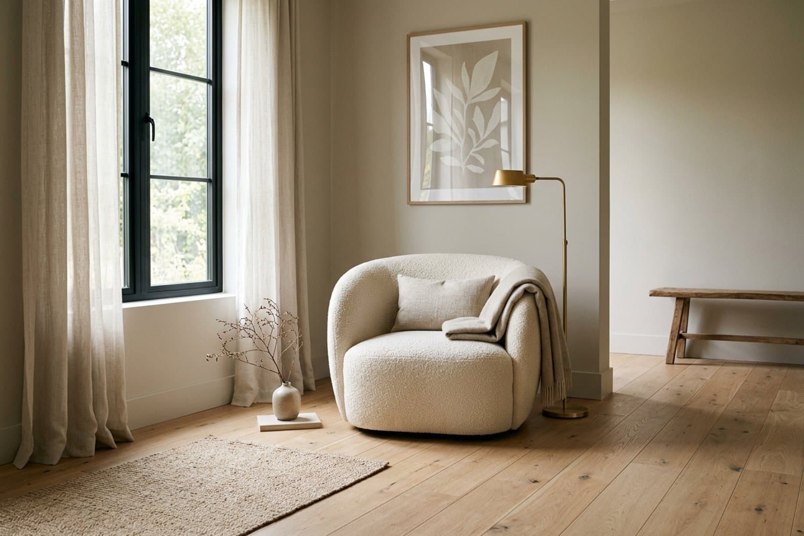
Paint Colors That Go With White Oak Floors (9 LRVs)
White oak floors want walls with a tan or green undertone, not pink or yellow. Compare 9 Sherwin-Williams and Benjamin Moore picks by published LRV.
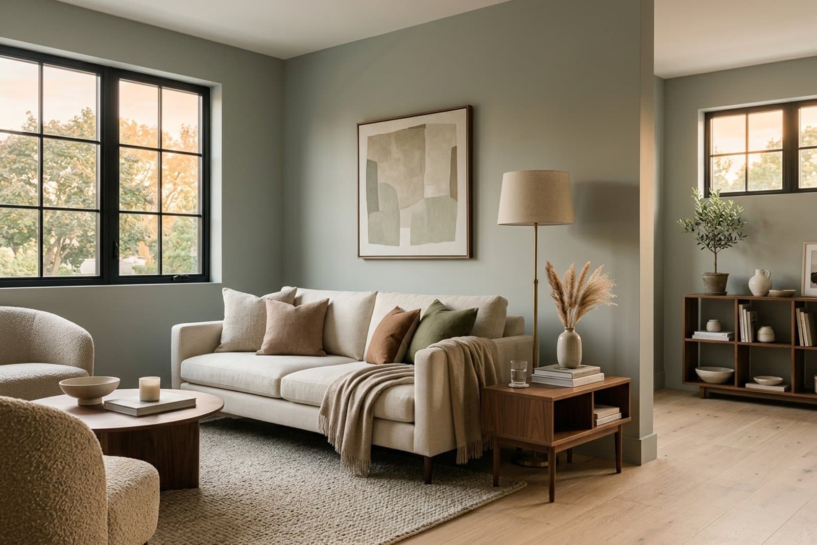
Best Paint Colors for West Facing Rooms (9 LRVs)
West facing rooms flip from cool morning shade to orange sunset light. Compare 9 Sherwin-Williams and Benjamin Moore picks by published LRV.